Rewind + January | Waxworks Candles branding | Fall + Winter collection
Today’s tidbit: “Simplicity is about subtracting the obvious and adding the meaningful.” ― John Maeda
This is the last of the rewind posts!! I love making these blog posts, but I am happy to say that I am finally caught up. From here on out it will be all new things as they come along with some reflection posts.
True friendships are treasured, especially when you’ve been friends since elementary school! Emma and I have two things, among many, that we will always have in common — the love of horses and riding and of crafts and creating new things. Making candles for friends and family quickly turned from a hobby to side business for Emma. When Emma wanted to start selling the candles on websites like Etsy in 2010 and asked for my help with branding, I came up with the Waxworks name and logo. After that I designed the website banner and tags for the candles. Her business had been taking off in 2012 and she decided she wanted to enter some craft fairs but, depending on the craft fair, there are certain things your company and product have to qualify for in order to take part.
Sneak peek image:
Be sure to click below to read more and check out more pictures. Enjoy!
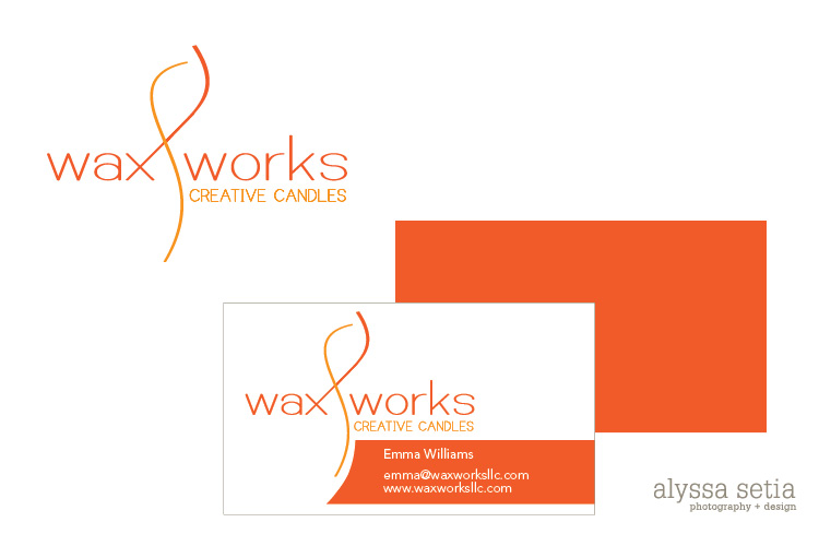
In light of these requirements, I designed her business card, which is simple, clean and has a pop of color on the back.
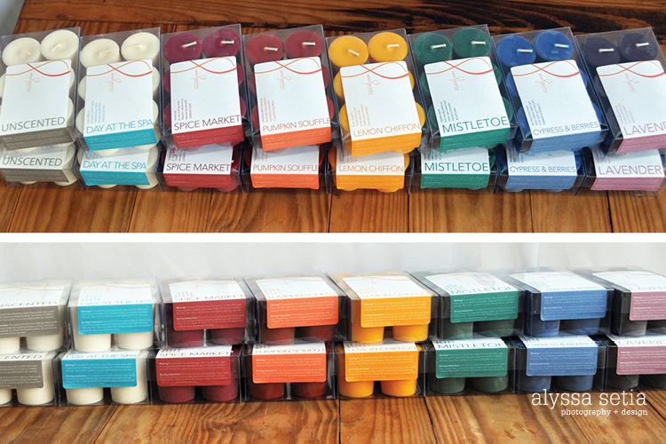
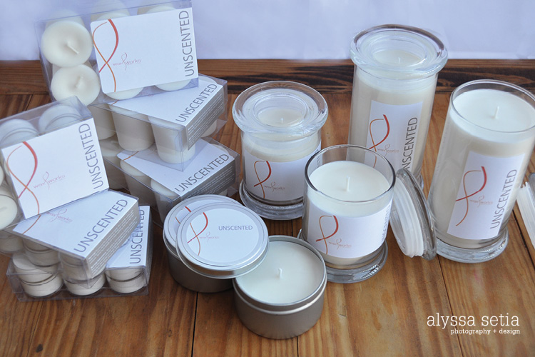
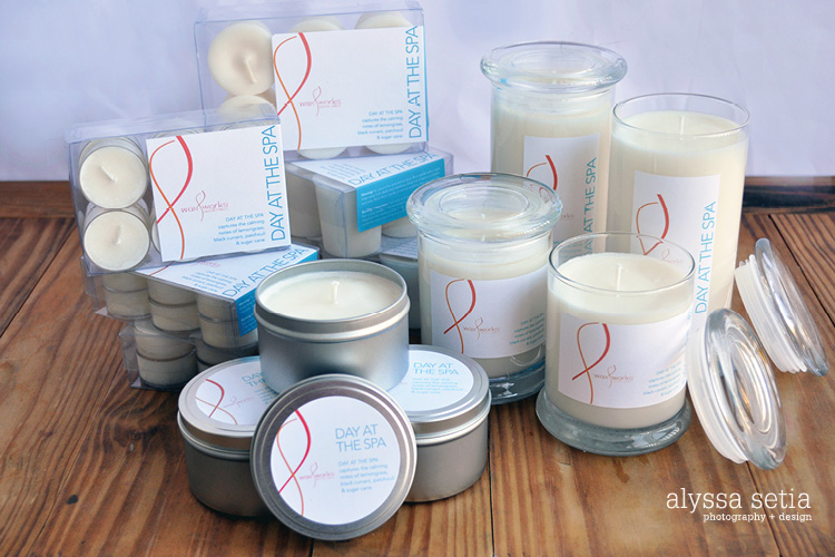
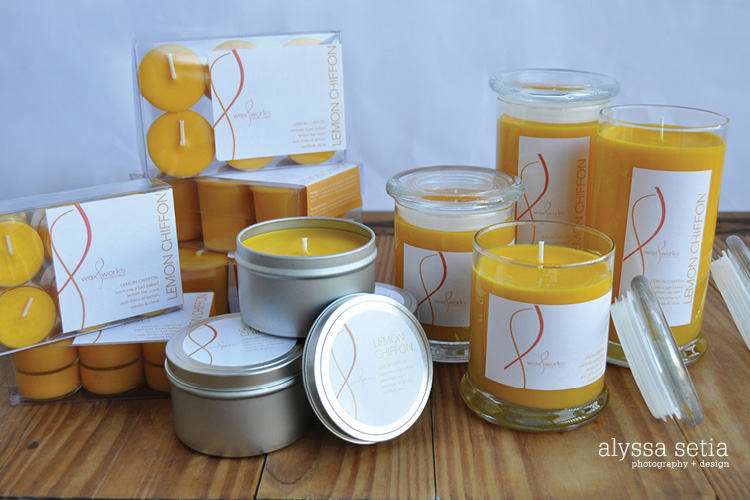
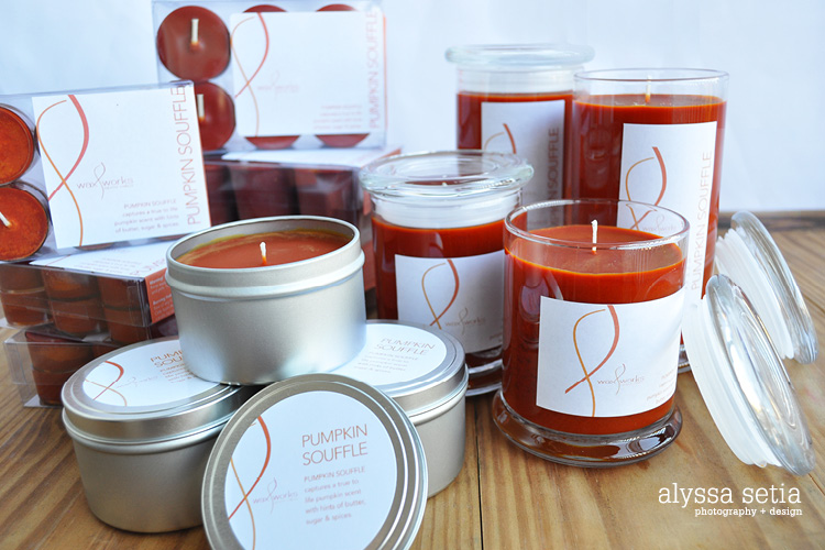
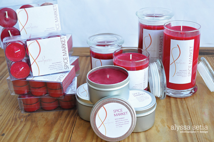
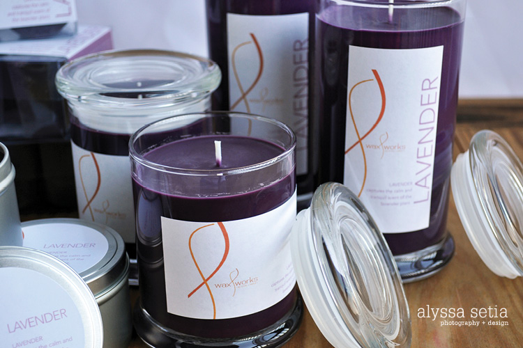
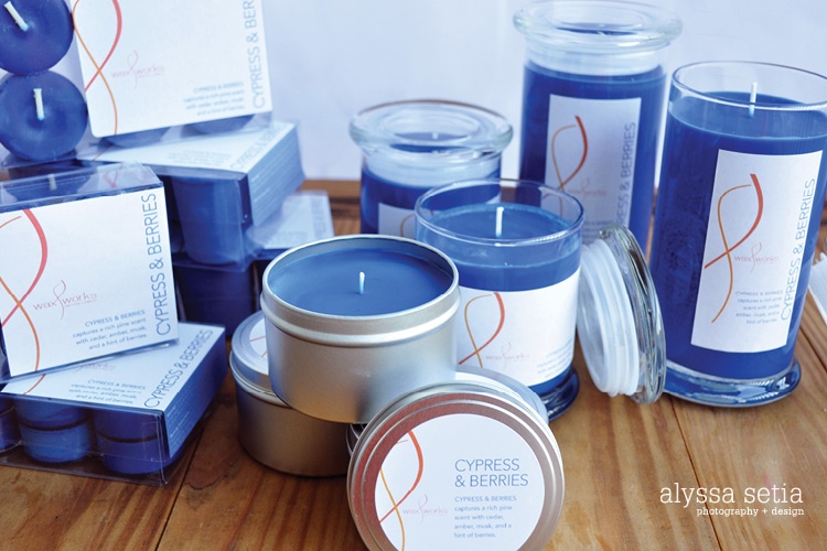
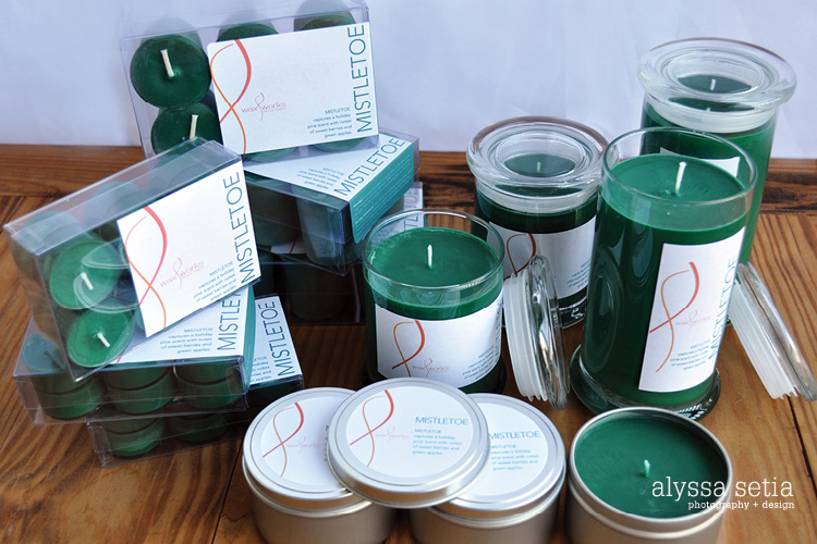
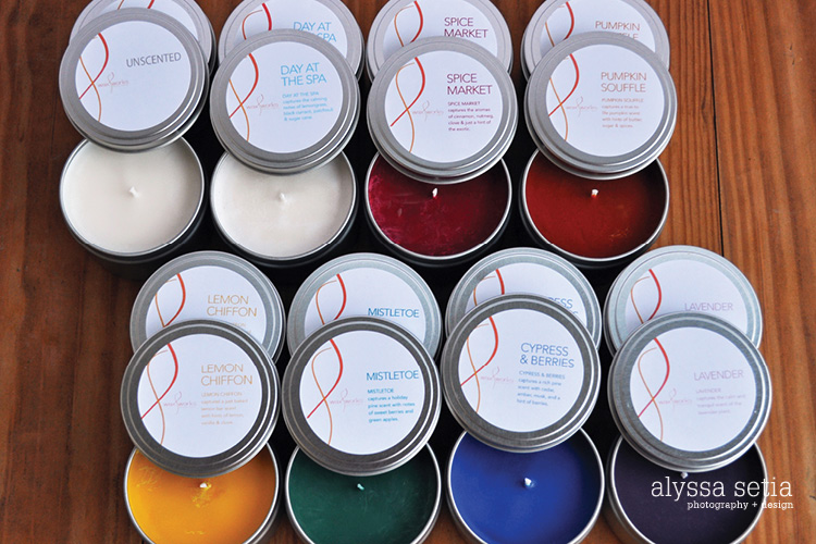
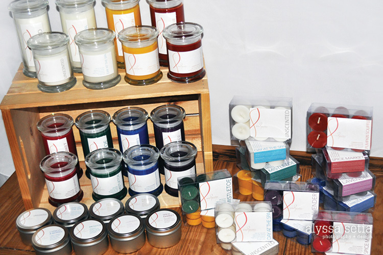
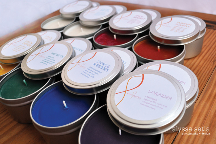
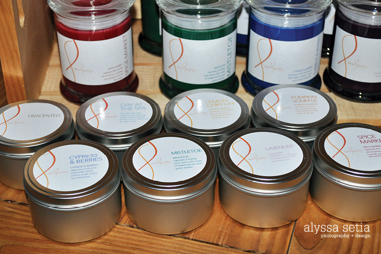
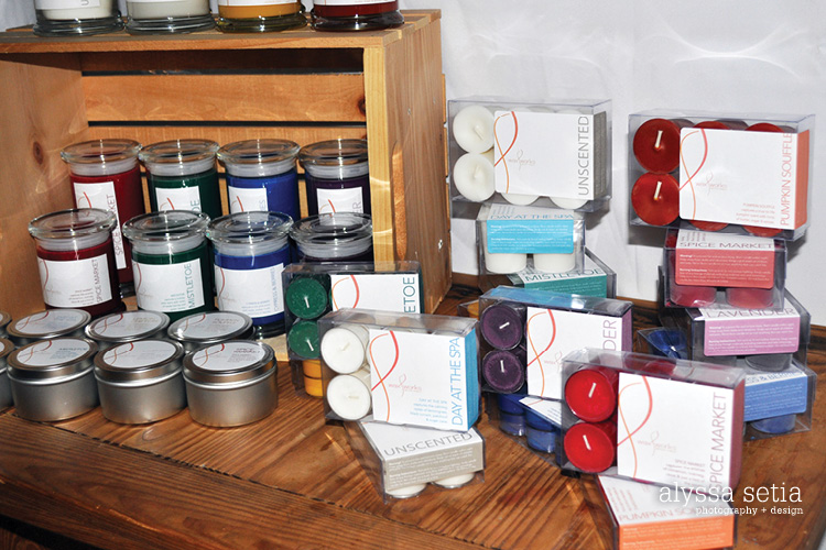
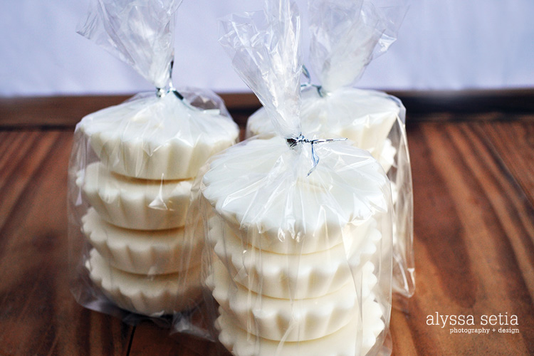
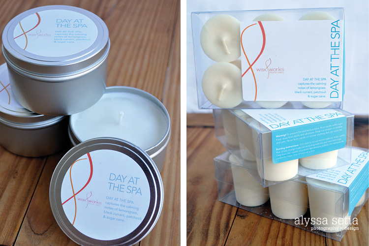
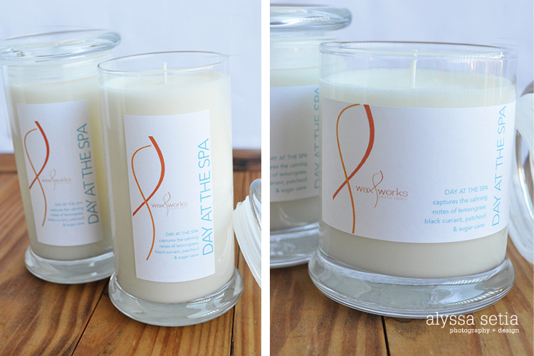
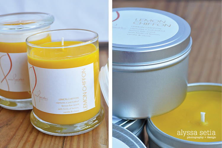
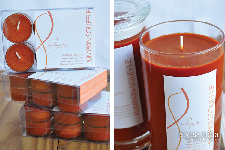
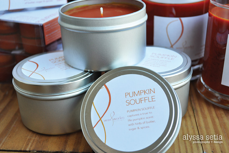
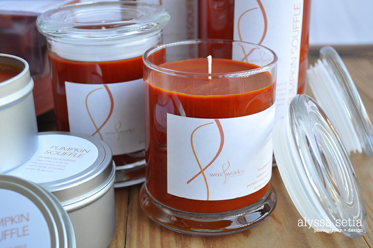
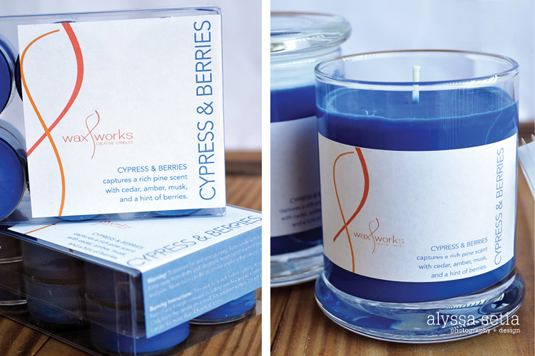
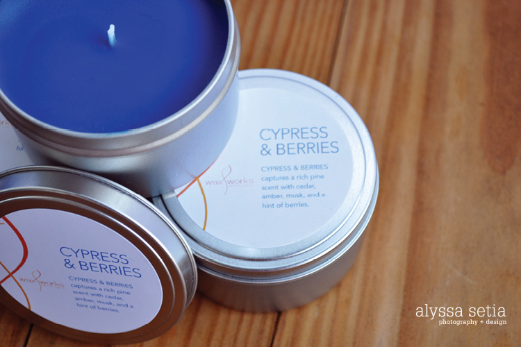
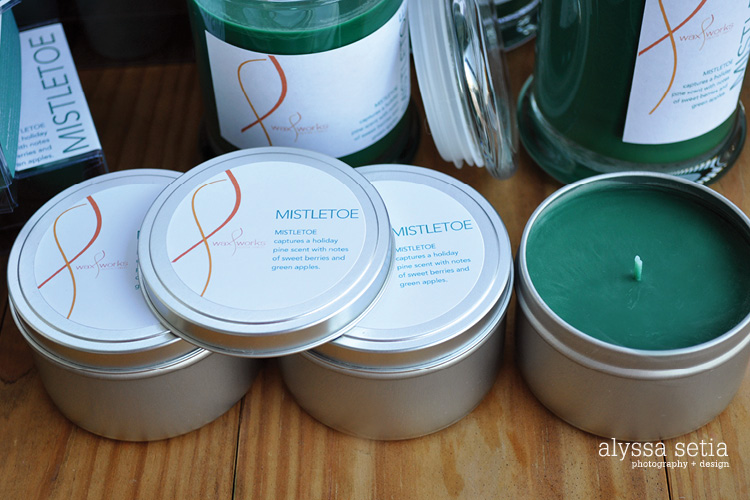
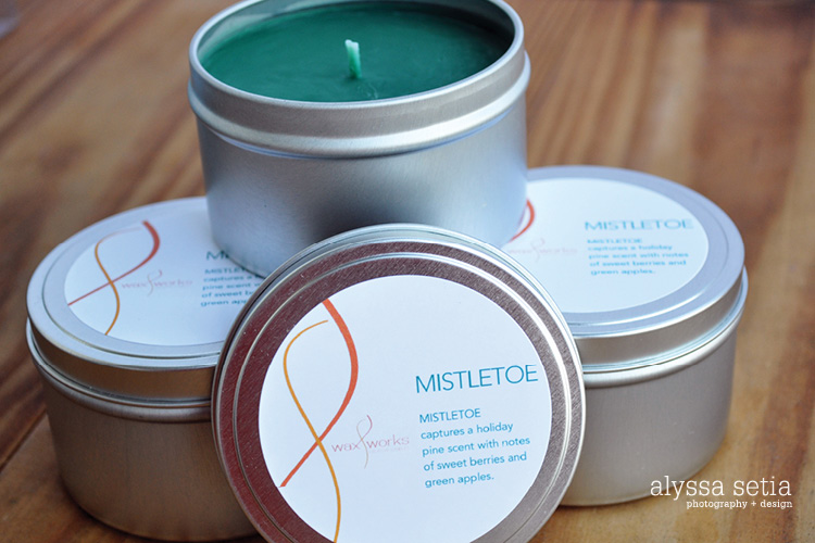
With her new fall and winter scents out, we met several times to talk about the direction she wanted to move in and all the different types and scents of candles there are so we could figure out the best size label for each. For this season she ended up having 8 scents, from a relaxing Day at the Spa to festive Pumpkin Soufflé, Spice Market and Mistletoe. They all are unique and smell amazing! There are many different types of each scent — including pillar, birthday, floating, small and large jar, tea light, tin and votive, making them perfect for any room and for anyone.
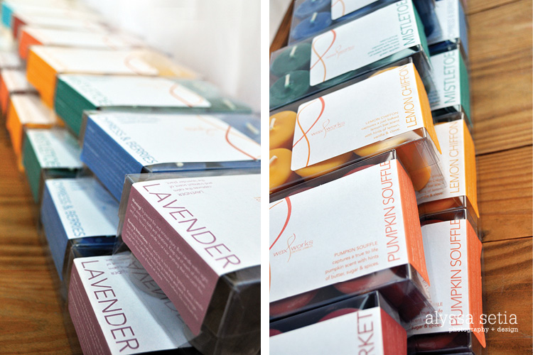
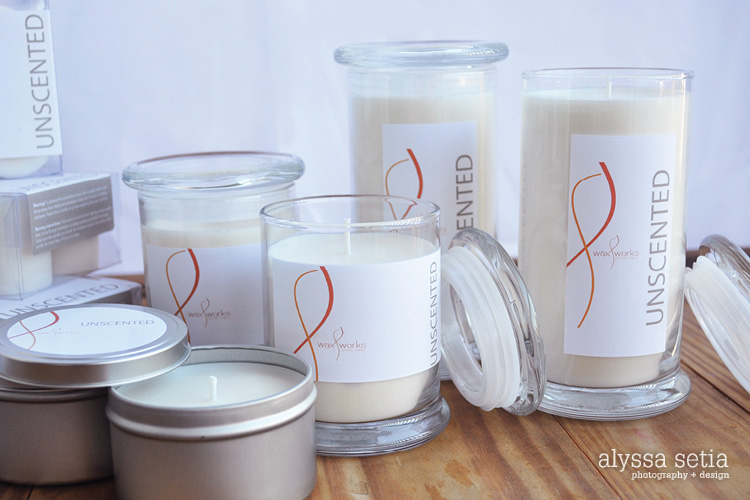
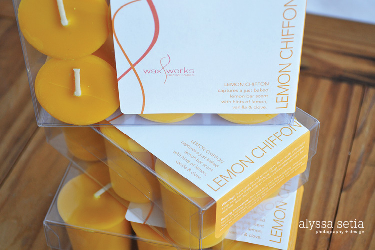
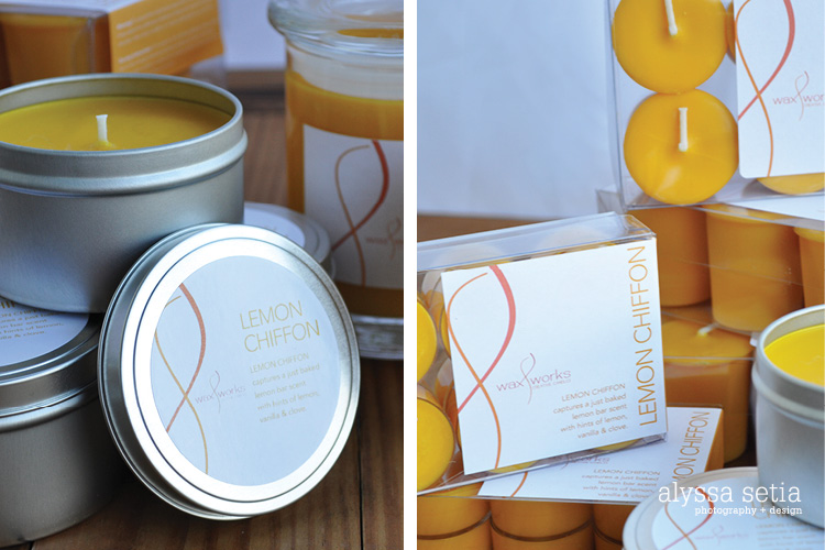
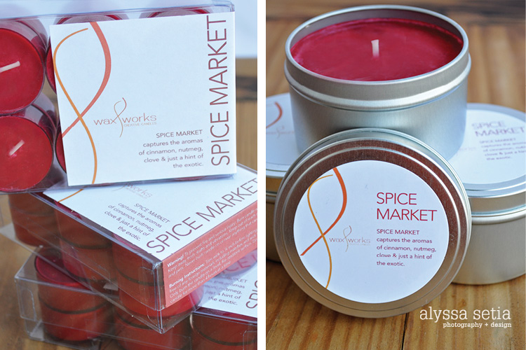
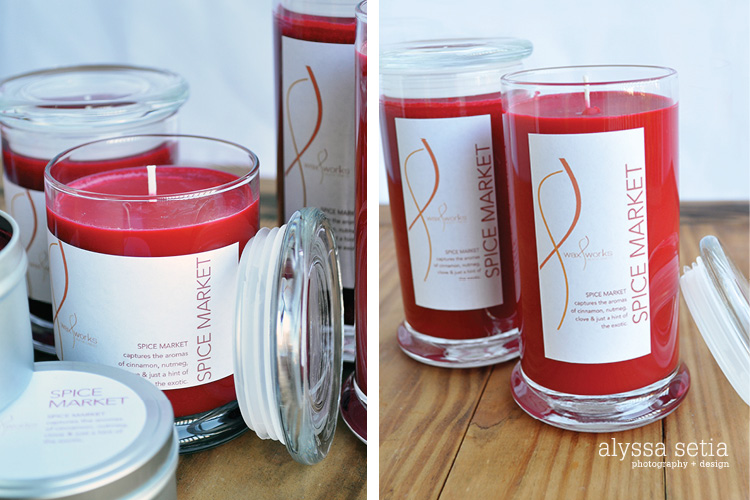
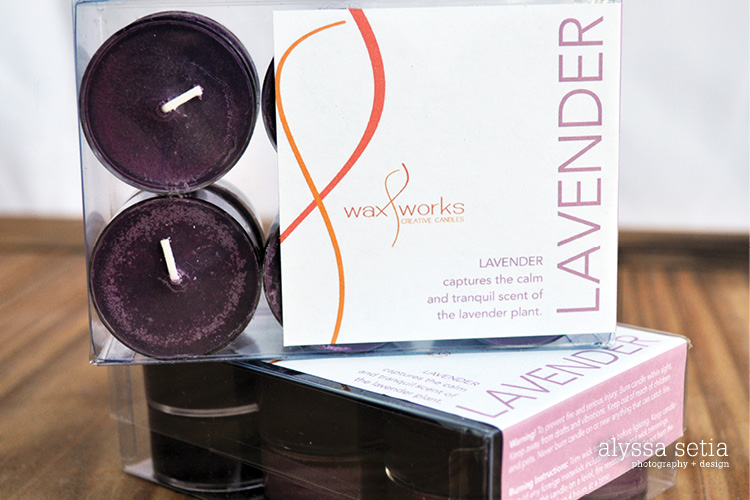
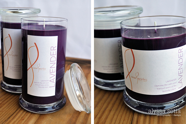
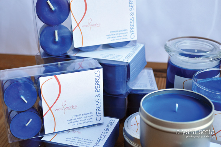
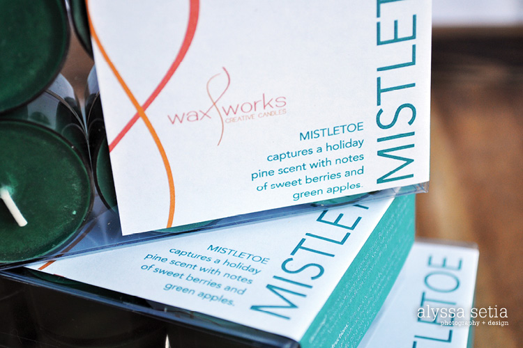
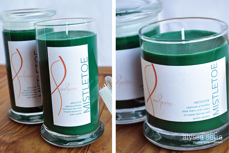
After some brainstorming and sending proofs back and forth, we decided to have each scent be it’s own color so it would be recognized easily. I came up with a design that plays off of the flame from the logo. The candles that have a box package (birthday, tea light and votive) have a color bar with the warning and burning instructions, which is shown on the front and folds to cover part of the right side. This is not only visually interesting (especially when the scents are lined up!), but it also helps to hold the box together. The rest of the circularly packaged candles have labels on the front and the warning info on the bottom. After the labels were designed, Emma had the fun job of printing them all out and placing them on everything before her first craft fair in December.
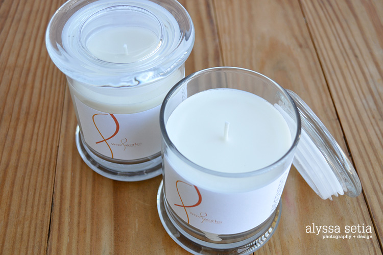
After that was finished, in January we met to do a photo shoot with all the candles. This was both for my portfolio and for her to use to update her pictures on Etsy. It was time consuming, but we had fun doing it and I loved seeing the full effect of all the labels on the candles. One thing that is so important to package design is to make sure your designs keep in mind where the product will live and how it looks with multiples. You have to think about it differently because you’re designing 2D but the final result will be 3D. Yet I really do love package design, ever since it was one of my most challenging yet favorite classes at GMU. This was another really fun project for me because, like the Save the Dates it combined photography + design.
I am about to start designing new labels for Emma’s spring collection, so you can expect to see another post in the near future. Be sure to check out her Etsy site. There is nothing better than a handmade gift, and I know the amount of time and dedication that goes into these really comes through in the quality and enjoyment you will get with using them! Enjoy.
